Note: This post is designed for my Canadian readers. Americans will find a counterpart more appropriate to their needs here on Stephanie Brail’s Wholistic Substack, or on Newsnongrata here.
Not even death isn’t simple, if you are trying to compare mortality between nations.
It is important nonetheless.
Excess deaths data during the pandemic is arguably our best argument against any return of the COVID lockdowns. Within a year, mortality data may also give us the final verdict on the wisdom and efficacy of vaccine mandates. For this reason, it behooves all of us to understand the different ways that mortality can be measured, as these different measures can either obscure or clarify reality.
I’ve found a great tool that anyone can play with to explore mortality stats around the world. The data widget at Mortality Watch is both immensely powerful and remarkably user-friendly. It’s also a wonderful model for how the Canadian Government could transform it’s current opaque and parsimonious approach to mortality data.
You can ask Mortality Watch to generate any of a variety of mortality statistics, specify a range of years, select specific countries, and - shazam - your choices will be instantly turned into a graph.
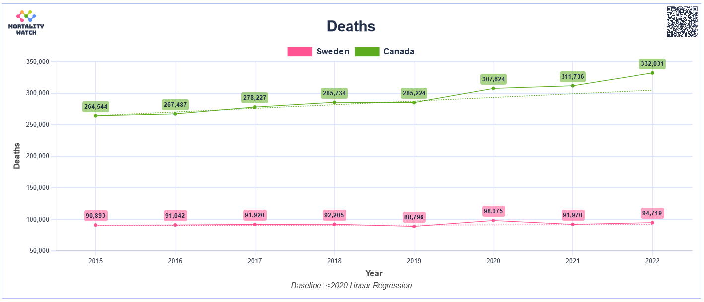
For example, this graph looks at deaths in both Canada and Sweden over the past eight years:
Though it’s immediately apparent that deaths in the Canada shot up to roughly 35,000 more than normal in each of the past three years, and that changes in Sweden’s death rate were visibly more modest, the huge difference in population size between the two countries makes it hard to properly compare outcomes between the two countries.
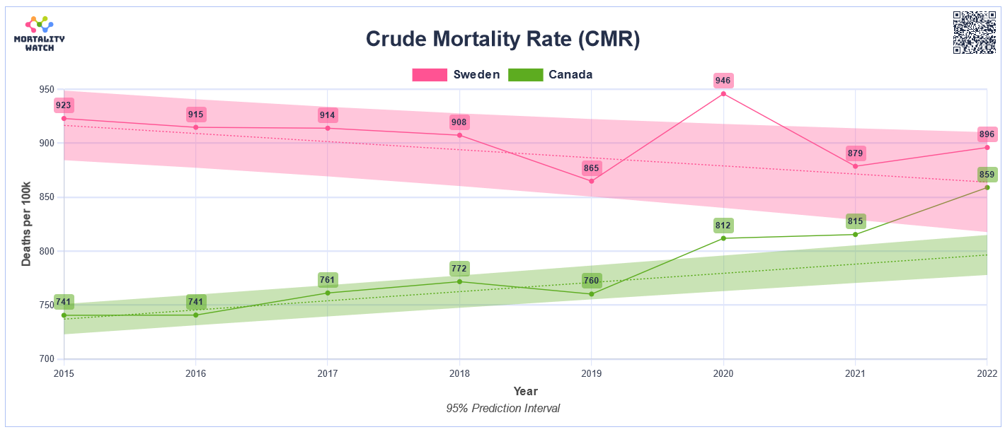
We can solve this problem of differing sizes by measuring the rate of excess deaths instead of the raw number:
Now it is easier to directly compare the two countries. It’s obvious that Canadian deaths are well outside previous trends during all three pandemic years, while deaths in Sweden increased more modestly - only going outside the normal range in 2020. (The shaded bands represent the normal range.)
Some things don’t look right though. Life expectancy in Sweden is similar to Canada, but on the graph the death rate in Sweden is higher than in Canada in every year. How can that be?
It also looks like mortality rates were rising in Canada between 2015 and 2019, which would require a decline in Canadian life expectancy over that period. (Which didn’t happen.)
What’s going on here? After decades of falling birth-rates, the average age of the population in many countries has been steadily rising. This has happened somewhat in Canada - softened by young immigrants - but has left Sweden with a disproportionate number of seniors. The older a population gets, the higher the death rate. It’s possible to correct for this distortion by adjusting death-rate calculations to be what they would be for a standard age-distribution.
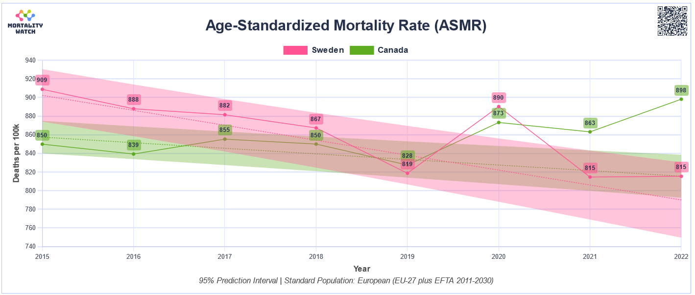
Here’s what it looks like if you compare Canada and Sweden after adjusting to an age-standardized population model:
Now we have a graph that gives us a truer picture, both of what happened in Canada, and the relative performance of Canada and Sweden.
The first thing to note is that death rates were falling in both countries between 2015 and 2019. That’s good - it means life expectancy was rising.
The pink and green shaded areas show the normal ranges of variability to be expected in the mortality rate. Nineteen years out of twenty, mortality rates will stay within the shaded area. The dotted pink and green lines shows the expected number of deaths based on past history.
Canadian death rates in the period from 2020 to 2022 were significantly outside the green band that specifies the normal range.
Now look at Sweden. Though death rates in Sweden in 2020 were modestly outside the normal range, death rates in both 2021 and 2022 were both well within the range of normal. Even in 2020 Swedish deaths weren’t that far out of ordinary - lower in fact than they had been back in 2015. Swedish mortality rate changes during the pandemic years were little more than the bad blip one would expect if Sweden had experienced a bad flu season in 2020, not survived three years of a pandemic.
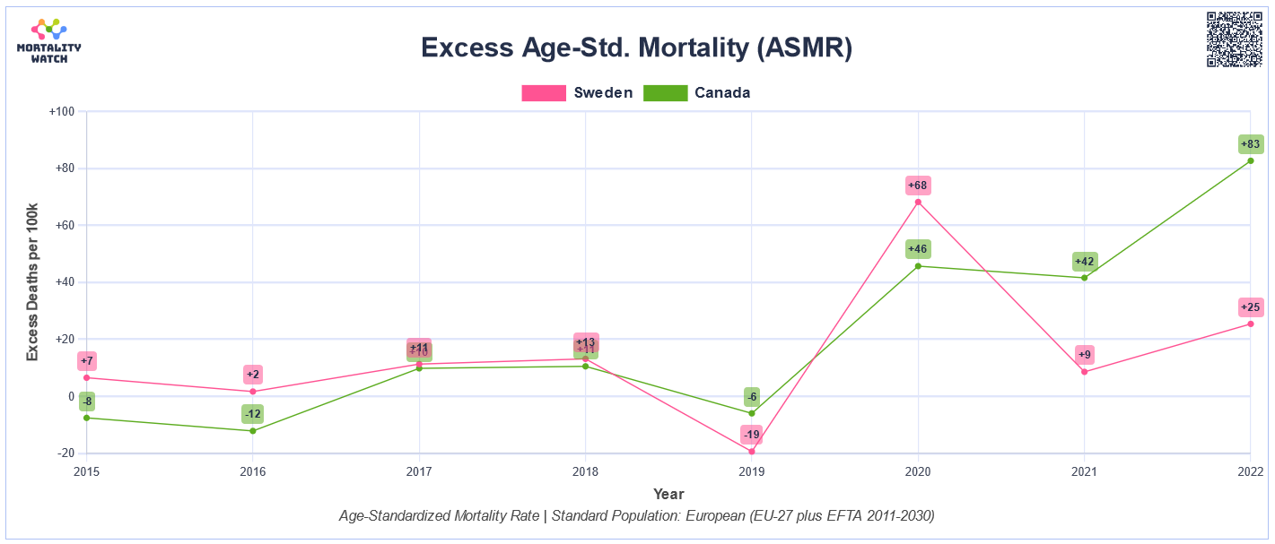
Because mortality rates in normal times change very little from one year to the next, it is possible to calculate an expected number of deaths based on past data. Mortality over or below that expected number is called ‘excess deaths.’ Again, you can either use the number of excess deaths, the crude rate of excess deaths, or, better yet, adjust for changes in the age structure of the population:
The data again shows a very similar pattern. If you subtracted everything above the dotted lines for both countries from the previous graph, this is what would remain. Canada had modestly fewer excess deaths than Sweden in 2020, considerably higher excess deaths in 2021, and even higher in 2022.
Because excess deaths specifically track changes from the norm, they are the mortality statistic most often used.
I would invite you to play with the Mortality Watch Explorer. See how the data looks different using the different metrics. How does the data look different if you ask the widget to create a bar graph instead of a line graph? If you’re ancestors came from Denmark, or Croatia, how did that country do?
There’s only one thing that bothers me about Mortality Watch data widget. Why the hell isn’t the Canadian Government putting their data in a form that’s this easy to access and understand?
The person who created Mortality Watch, a ‘Ben M.’, describes himself as a “Silicon Valley Software Engineer”. How is it that a single California software engineer, perhaps in his spare time, can create a program that is more user-friendly than anything that phalanxes of statisticians at Statistics Canada can create?
StatsCan’s website can only be described as user-hostile. Every once in a while The Daily will release a few dribbles of mortality info. Otherwise, the site seems designed to restrict users to only the data the Government wants us to see.
There is no reason on Earth that StatsCan could not design a data widget that could create instantly graphs for specific causes of death over a chosen period in time.
If a person wanted to know, for instance, how suicide rates in Ontario changed between 2000 and 2022, they’d just select those boxes and up would pop the graph. How did the number of accidental deaths change before and after COVID? What about cirrhosis of the liver deaths? Drug overdoses? Myocarditis deaths in teens? All that information could be available instantly in an easy-to-understand format.
It’s clear to me, there’s only one reason those user-friendly data widgets don’t exist. Too much data deeply embarrassing to the Canadian Government would emerge.
As taxpayers, all Canadians paid to have that mortality data collected. Doesn’t that entitle us to know what’s in the data?


