


500+ Unexplained Excess Deaths a Day!
A Disturbing New Trend in U.S. Mortality Data

Before exploring a disturbing new trend in U.S. mortality not caused by COVID, a short primer on mortality statistics would probably be helpful.
On an individual basis, mortality is quixotic. You and I can never know when our time will come. But if we look at national populations, deaths do follow very predictable patterns.
At any given age, mortality rates are generally pretty stable from one year to the next. We can predict the number of deaths for any age group by multiplying the death rate for that age group times the number of people in that age group. If we then sum all the different age groups we can then come up with a national figure for Expected Deaths which takes into account both increases in the population and changes in the age structure of the population.
Not only do deaths follow a predictable pattern from one year to the next, they also follow a predictable pattern over the course of the year. Statisticians can predict the expected number of deaths for each week of the year based on past years.
Deaths typically don't follow the predicted pattern exactly. Flu season may come early or late. Some years flu or pneumonia is more deadly than others. That said, in normal years, deaths will almost always be within plus or minus 3.5 percent of the Expected Deaths figure. The upper limit of that expected range of mortality is called the Upper Bound Threshold. The Upper Bound Threshold effectively marks the upper end of normal for any given time period.
Now, Let's look at the CDC All Cause Mortality data for the United States for the past four years.
Here's a screenshot taken November 12th, 2021 from the CDC site Excess Deaths Associated with COVID-19: https://www.cdc.gov/nchs/nvss/vsrr/covid19/excess_deaths.htm
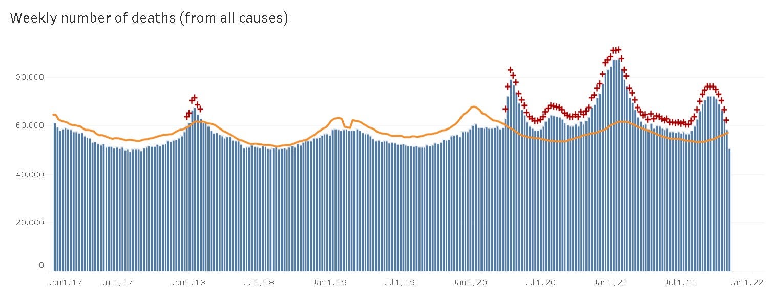
What do we see here? The blue bars represent the numbers of American deaths from all causes in a given week. The orange line is the Upper Bound Threshold marking the upper range of normal for expected deaths. For the years 2017, 2018, and 2019, the actual number of deaths is always well within the normal range, with one exception. For six weeks in the winter of 2017/2018 we see deaths spiking above normal, flagged with red crosses. The winter of 2017/2018 saw the worst flu season in several years, so bad that the death rate spiked above the normal range for six weeks.
Looking to the right of the chart, deaths spiked above normal in the week ending March 28th, 2020, and have remained above normal every week since, as evidenced by the multitude of red crosses.
What this chart doesn't tell us, is how many of those excess deaths were from COVID, and how many had a non-COVID cause. Fortunately, the CDC has tracked that data too, although several steps are involved in finding that data:
1) Go to the CDC website: https://www.cdc.gov/nchs/nvss/vsrr/covid19/excess_deaths.htm
2) Scroll down to the Blue Bar marked "Options"
3) Click on the circle just above where it says "Excess deaths with and without COVID-19"
4) Click on the button below that says "Update Dashboard."
If you do that, you'll see a graph that looks like this:
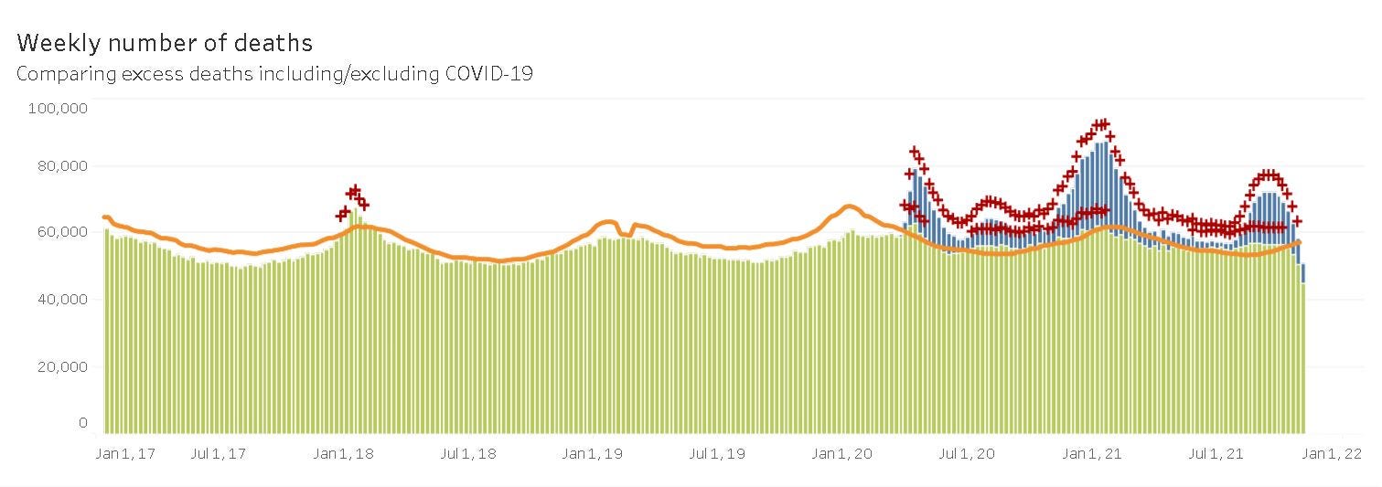
We see a similar graph to the one before, except now only the COVID deaths are in blue. All deaths from non-COVID causes are in green. What does this graph tell us?
First of all, it tells us non-COVID deaths have been higher than normal during much of the COVID pandemic. We can be suspicious that some or all of the "non-COVID" deaths excess to normal in the early months the pandemic were in fact people who died of COVID without being diagnosed as such.
That's seems an unlikely explanation for why non-COVID deaths would be elevated above the normal range for every week from the beginning of June 2021 till the end of September 2021. (On the chart, this abnormality is flagged with a second series of red crosses indicating that not only were the total deaths outside normal, but even the non-COVID deaths were in excess of normal.
There's one final piece of information that's important to know about both of the above charts. The charts are based on death certificates received by the CDC. The pandemic has put a lot of pressure on public health systems, so death certificates are often filed late these days. The further you get towards the right side of the charts above, the more incomplete the data is. Though it looks like death rates fell sharply in October 2021, this almost certainly represents incomplete data more than any decline in the death rate.
Can we quantify the number of non-COVID deaths in excess of normal for the summer of 2021? Yes, the CDC can provide the data needed to make those calculations. They provide weekly data on both the number of COVID deaths, and the total number of deaths from all causes here:
https://www.cdc.gov/nchs/nvss/vsrr/covid19/index.htm
The number of weekly expected deaths can be found here, mousing over each week on the chart:
https://www.cdc.gov/nchs/nvss/vsrr/covid19/excess_deaths.htm
From there we can build the following table:
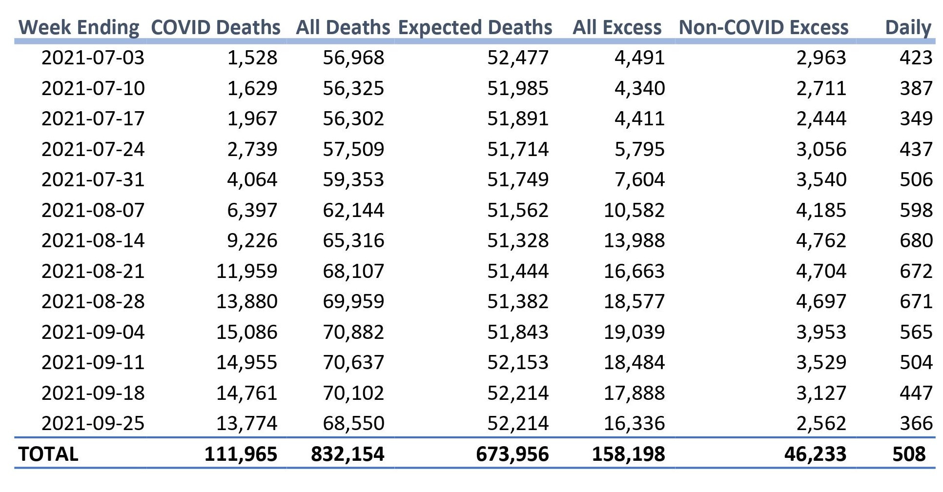
What does this chart tell us? In a nutshell, it tells us that:
In the period between June 27th and September 25th, 2021,
an average of 508 Americans died each day in excess of normal
due to non-COVID causes.
Over the full three months, 46,233 Americans died of non-COVID causes in excess of what would normally be expected.
Even that number understates the true number of non-COVID excess deaths because the mortality data is not complete, particularly for the most recent weeks.
The data for the above table was posted November 17th. The above table was originally built using data posted on November 12th. In three days of postings, the average daily deaths over the three-month period rose from 483 to 506. More recent weeks saw a larger increase than earlier weeks.
If you look at the above table, it appears the excess deaths not caused by COVID peak in the week ending August 14th, at 680 deaths per day above normal. It would be reassuring to think the worst was over. But that may reflect the incompleteness of more recent data rather than any fall off in the number of excess deaths. We'll have to wait and see whether excess deaths are falling or not.
What we can say for sure is that the number of excess deaths over the summer period will not go down as more data comes in: It can only go up from here.
There were an average of 1,230 deaths per day from COVID during this 13-week period - a wave of deaths that created a great deal of national consternation. Something else was killing an additional 506 Americans per day above normal: not as catastrophic a number, but far from trivial.
There are any number of possible causes for the rise in non-COVID mortality seen over the summer. It could be any or all of the following:
• Treatable diseases didn't get treated because of fear of COVID in hospital.
• Stress-related deaths, including stress-induced drug overdoses
• An unrecognized after-effect of COVID infection
• An unrecognized long-term side-effect of COVID vaccination.
• Something completely unrelated to the pandemic.
I am quite frankly shocked by the silence of the CDC on this matter. I suppose the CDC can hide behind the fig leaf of incomplete data, but even with the data we do have it's obvious that something far-outside-of-normal has been happening in recent months.
I strongly suspect that the CDC has been silent because the new Biden-appointed CDC Director Rochelle Walensky has politicized the agency to reflect the agenda of the Democratic Party at the expense of science. We've already seen that in the CDC Director's willingness to invent statistics in support of mask-wearing and to ignore 102 Research studies on the robustness of naturally-acquired immunity The last thing Rochelle Walensky wants is a lot of public attention being brought to the fact that an unusual number of Americans are dying, and we don't know why.
The problem is: We cannot do anything to mitigate whatever issues are causing the recent spike in deaths until we know what is causing those deaths.
The CDC has the capacity to dig down into the raw data. They could tell us which causes of death spiked over the summer, and whether those excess deaths were concentrated in a particular demographic. But to do that, the CDC must first admit that something strange and worrying has been happening in recent months.
To summarize: During the three most recent months for which we have reasonably reliable data, 500+ Americans per day in excess of normal were dying from causes other than COVID. It’s a given that the final toll will be higher still - we just don’t know yet by how much. We also don’t know yet when - and if - deaths not caused by COVID will return to normal levels.
Bruce O’Hara
P.S: We can only hope the increase in US excess mortality seen over the summer is not related to this story in some way!
Important Update on November 19th: The CDC has suddenly changed both how they show the data and how they calculate Expected Deaths. Why would they do that six weeks from the end of the year? You don’t suppose they didn’t like what the data showed, do you?
Here’s the data as posted on Tuesday the 16th, also seen above:
Now look what it looks like if you go to the exact same site on Friday November 19th:

What have they done? They’ve added a yellow line for the Expected Deaths which coincidentally hides a lot of data and makes the chart much harder to read. How unfortunate! You’ll notice the shape of the line has also changed. Though it’s not easy to see directly, if you check the data by mousing over the various weeks in the new chart, you’ll find the number of Expected Deaths has gone up significantly from that shown on November 16th.
Looking at some sample weeks, for the week ending July 3rd 2021 the Expected Deaths has risen by 1,323. For the week ending August 7th, Expected Deaths has risen by 1,689. For the week ending September 25th, Expected deaths have risen by 2,159. The upshot of this is that much higher Expected Deaths would greatly reduce the Excess Deaths if I recalculated my Table above using today’s new Expected Death figures.
In fairness to the CDC, there are some tricky issues in calculating Expected Deaths during a long pandemic. Last year the deaths were so outside of normal, it didn’t really make sense to include last year in calculating the ‘normal’ death rate, which is what Expected Deaths is supposed to represent. They needed to come up with a work-around to deal with that issue, which they did.
Now suddenly, the CDC has decided the method they had been using all year to calculate Expected Deaths was no longer working, and that they needed to calculate Expected deaths in a new, significantly different way. This new way of calculating Expected Deaths made most of the Excess Deaths of the past few months suddenly disappear. Poof. How very convenient. For an organization as politicized as the CDC has been in recent months, this is an extremely convenient outcome. Still, never assign to malice what simple incompetence can explain. That being said, I am feeling less than comfortable with the CDC as a source of mortality data. It has lead me to want to seek out other sources of mortality data that may be more trustworthy and less quixotic. I’ll report back next week.
My blog is at: Newsnongrata.com
Note 1: To quickly go over what's in the table above:
1)The first four columns are taken directly from the CDC sites shown above.
2) All Excess deaths equals All Deaths less Expected Deaths
3) Non-Covid excess deaths equals All Excess deaths less COVID deaths
4) Daily excess non-COVID deaths equals weekly Non-COVID deaths divided by seven.
chill sandwichman no need to write a whole school essay on comment dog
I did statistical analysis of seniority for some of the unions involved in the merger of Air Canada and Canadian Airlines 20 years ago. The stats consultants on the other side were very much into finding images in the charts, like "sailboats" that they could build a narrative around. I just looked at the charts to see if there was any obvious discrepancies. There were.
In the chart you show, what catches my eye immediately is the totally anomalous drop of non-COVID deaths below the orange line IMMEDIATELY after the peak of COVID deaths in roughly February(?) of 2021. As a student of mortality statistical probability going back to John Graunt in the 17th century, I can assure you that didn't happen. Notice that in the earlier two peaks, the "non-COVID" excess deaths rose in tandem with the COVID deaths. This time, they inexplicably dropped right after the peak? Nope. Not buying it.
What I think you have there is progressive accumulation of reporting delays. In other words, "noise." Unless you can explain why non-COVID deaths dropped in the wake of a COVID peak, statistical noise is the most reasonable explanation.